
Caroline Rodewig and Garrett McGrath are members of FlightAware's Flight Tracking Wing. As lead for the Predictive Technology Crew, Caroline works to expand the scope and quality of our predictive applications. Garrett is the lead for the Aviation Platform Crew and responsible for the performance, reliability and observability of multi-machine Hyperfeed.
Monitoring Hyperfeed: The History and Challenges of a Distributed System
The Aviation Platform crew (for an explanation of crews and wings, see this blog post) revolves around the performance and reliability of Hyperfeed[1]. Hyperfeed is FlightAware’s core flight tracking engine. Its output powers the company’s most salient offerings: the flight pages on the website, Firehose, FlightXML, and flight alerts. So if Hyperfeed stops working, so does much of FlightAware. Given the impact of a Hyperfeed outage, we need to know immediately if something goes—or might go—wrong so that we can act swiftly and precisely to remedy the situation. For maintaining the requisite accuracy and timeliness of Hyperfeed’s output, we rely heavily on monitoring[2]. To that end, we have recently begun adopting Prometheus, a time-series metrics database, and Grafana, a powerful visualization platform. The introduction of these tools marks a significant upgrade and improvement to Hyperfeed’s current monitoring stack. It is hoped that by sharing our experience and the reasons for adoption that we can help inform the decision-making of others in an analogous situation.
Before discussing Prometheus and the many enhancements it brings to our monitoring of Hyperfeed, it helps to provide some context by examining what we currently use and how it has evolved over time. In its current form, Hyperfeed is a distributed system composed of a constellation of more than a dozen components and sub-systems spread across multiple machines for performance and fault-tolerance. Its sub-systems include a number of other well-known services: Postgres, Zookeeper, Kafka, and RabbitMQ. It wasn’t always like this, though. When I started working on Hyperfeed in 2016, it was not distributed; its components all ran on a single machine (this is not strictly true as it also used a Postgres database running on a separate server). Naturally, monitoring at that time was relatively less complex: it had markedly less surface area to cover. We were able to do the job effectively with a combination of custom, in-house tools and a heavy dose of Zabbix.
Our custom monitoring tools mostly consisted of some scripts that followed Hyperfeed’s output and its logging statements looking for problems, e.g., the output has stopped completely, the output is out of date, or an excess number of tracebacks happened. These tools were specific to Hyperfeed and did not generalize well to other software. Zabbix, on the other hand, has been FlightAware’s primary monitoring and alerting framework. It is used throughout the company and not specific to any piece of software. When applied to Hyperfeed, Zabbix monitored some key characteristics of the server running the application such as CPU, memory, disk, and network usage. Moreover, the aforementioned custom tools fed their data into Zabbix so that they could be used for alerting an engineer if something went haywire. On top of that, Zabbix gave us a basic web interface for viewing the data it collected in a graphical format. Back when Hyperfeed fit snugly on a single server, this sort of monitoring served us well: Zabbix was a one-stop shop for all things monitoring. But as the demands placed on Hyperfeed grew, so did its operational complexity.
Eventually, a single-machine architecture was not enough to handle the increased volume of Hyperfeed’s input, which was precipitated by FlightAware acquiring new data sources, and expanding its existing data sources. In order to accommodate this change in scale, it was necessary to distribute Hyperfeed across multiple machines. When this happened, we continued using (and still do use) custom tools and Zabbix for monitoring. Our custom tools, though, and the data we send to Zabbix necessarily expanded, too. Although distributing Hyperfeed across multiple machines was necessary and improved the performance and reliability of the system, it also brought with it new challenges and difficulties, particularly in terms of monitoring[3].
Given their origin, our custom tools were not designed with a distributed setting in mind. As such, they lacked the ability to easily aggregate data across multiple machines and were somewhat cumbersome to operate as Hyperfeed’s architecture progressed. In addition, Zabbix started creaking and revealing some rough edges as we placed more demands on it. A core issue was that Zabbix does really well at monitoring particular machines but not as well at system or application level monitoring, especially in a context where services can move around from machine to machine as failures occur or as an intentional part of the design. In a distributed setting, it also imposes non-trivial operational burdens, e.g., when adding new monitoring points or spreading the collection load across machines. Moreover, Zabbix combines all monitoring functions into a single monolith rather than the current best practice of loosely coupling monitoring tasks like collecting data, long-term storage, querying data, alerting with deduplication and aggregation, and visualization/dashboarding (for further details on monitoring system best practices, see the Google SRE workbook’s monitoring chapter).
As Hyperfeed moved to a distributed architecture, a change driven by business demands and an increased volume of flight tracking data, it became clear that our monitoring tools, while mostly satisfactory in alerting us when something failed in the system, neglected to provide us with many of the other benefits that monitoring can offer. In particular, we were weak in whitebox monitoring and visualization[4].Whitebox monitoring is especially important for analyzing long-term trends, comparing experimental groups, and in guiding capacity planning and other engineering decision making. Some information can only come from the vantage point provided by whitebox monitoring. For visualization we had Zabbix, but its capabilities there are fairly limited and inflexible. Given all of this, we started looking for a new solution to fill in the gaps in our monitoring approach, something designed for dynamic, distributed systems. We chose Prometheus and Grafana. This combo of tools addresses the shortcomings of our current approach, and also brings with it a number of additional virtues.
Upgrading Monitoring with Prometheus and Grafana
Prometheus: Time-Series Metrics
In an idealized monitoring practice, every event or state of a system is recorded so that it is available if needed: no detail is left out. Unfortunately, this only works in a hypothetical, theoretical scenario since it is impossible to store, process, and work with the quantity of data generated continuously by modern systems. Instead of capturing everything, one must grapple with what to monitor: how to turn the endless torrent of events in a system into something comprehensible, manageable, and actionable. To this end, Prometheus provides time-series metrics, which track aggregations of events in a system over some period of time, where an event refers to anything that might occur and can be quantified or measured. Some example events include a function getting called, CPU usage going up, a web request being made, a client connecting to a service or a cache hit happens.[5] Fundamentally, the monitoring offered by Prometheus periodically takes a snapshot of some of the events in a system, typically measuring how often or how quickly each event occurred. The value of a snapshot at any given point is often of less interest than its relative value: how the frequency of an event changes over time provides the actionable insight and value of metrics-based monitoring. To make this more concrete, in the case of flight tracking some example time-series metrics of interest might be:
- Departures per second
- Arrivals per day
- Cancellations per minute
- Diversions per hour
- Flight plans created per second
- Input messages processed per second
- Output messages generated per second
- 99th percentile of the time taken to process an ADS-B position over the last 6 months
Note that in order to keep the amount of data captured manageable, the contents of the input messages that trigger each of these events get aggregated away. With metrics, the rate of departures, for example, are measured throughout the system, but any single departure cannot be investigated. As succinctly summarized by Datadog, metrics provide “the big, broad-stroke measures that can help you quickly answer the most pressing questions about a system’s internal health and performance.“ Metrics can also capture resource utilization, like CPU, memory, or disk, and metadata like code revisions and configuration values. Time-series metrics, despite necessarily omitting a lot of detail, are still quite versatile, yielding practicable monitoring data for critical activities throughout a system.
Data and Operational Model
One of Prometheus’ main selling points is that it provides a powerful and conceptually straightforward data model for extracting metrics from a system of interest and tracking their rate of change over time. Each time-series metric tracked by Prometheus includes the following information:
- Metric name: a string indicating what the metric is for, e.g.,
hyperfeed_departures_total. - Help documentation: a string describing what the metric is for or where it comes from.
- Metric type: four types are provided, but two of them provide the atomic building blocks of the others. The fundamental types are counters, which can only go up or reset, and gauges, which can be set to any value.
- Labels: key-value pairs attaching additional dimensions to the metric. Labels provide a way of affixing more detail to the metric than can be conveyed by the name alone. The quintessential example is the URL path for a metric measuring a web server’s response time. With a path label, it is possible to track the response time for a particular URL but also to aggregate across all labels and view response time for any path. Labels provide additional granularity to metrics and provide enormous power at query time.
- Metric value: a
float64value. This is the value tracked over time. - Timestamp for when a particular value of the metric was obtained.
With the Prometheus data model at hand, the next major selling point, as hinted at in the previous section, is its relative ease for exposing whitebox metrics directly from the application or system it is monitoring[6]. Typically, this is accomplished by using a Prometheus client library in the language(s) of the system being monitored. All of the most popular languages have a library already, but FlightAware is a heavy user of Tcl, a lesser-used language according to the TIOBE index. Tcl does not have an open-source Prometheus library available, so I had to write one in order to take advantage of what Prometheus has to offer[7]. Thankfully, the Prometheus project has excellent documentation with detailed guidance for library creators, so the process of writing the library, while not trivial, was relatively simple and straightforward. With a client library at hand, the next step is to use it throughout the application being monitored, and then get those metrics into Prometheus.
Getting data from a client library into Prometheus requires that a process expose its metrics over HTTP and that Prometheus knows the hostname and port where it can request metrics[8]. Once the data gets to Prometheus it can be visualized using Grafana, alerted on using a separate component maintained by the Prometheus project, and queried and explored. Instrumenting an application with a Prometheus library is a relatively cheap operation in terms of computation and memory. Since metrics aggregate values over time rather than build up a sequence of values to send in a batch, there is a constant memory cost to a given set of metrics; the computational cost is very minimal, although not free[9].
Aside from instrumenting code directly with a client library, there are a number of so-called exporters available for exposing metrics from programs not written with Prometheus metrics in mind, e.g., Postgres, Kafka, or Zookeeper. Exporters act as translators, observing an application directly with queries and probes, converting the output of those observations into a format that Prometheus understands, and exposing the resultant metrics over HTTP in response to scrapes from a Prometheus server. With exporters in the mix, many of the most common open-source servers can be easily monitored with Prometheus metrics. If an exporter does not exist for a particular service, it is fairly easy to write a one and Prometheus’ official documentation provides some guidance on doing so. Not only does Prometheus benefit code that can use a client library, but the entire project comes with a very active ecosystem of offerings for getting whitebox metrics out of our systems.
Monitoring Improvement Case Studies
At this point in the discussion, although the power of Prometheus has been outlined—it is conceptually straightforward but powerful, boasts strong visualization support via Grafana, was built for dynamic, distributed systems, generalizes to other wings at FlightAware, has equally strong support for whitebox and blackbox monitoring and excels at systems-level observations and analysis—it still might not be clear what benefits Prometheus provides over the current Hyperfeed monitoring system. To militate against any doubts of this type, we will now look at two specific cases where Prometheus supersedes our current praxis and contributes to our general excitement and enthusiasm about adopting it for monitoring one of the core pieces of FlightAware’s infrastructure.
Surpassing Custom Tools
The first case involves an in-house library, currently out of commission, but used for several years in Hyperfeed for whitebox monitoring. This in-house library provided an event counter: its API took the name of some event of interest and behind-the-scenes it would increment an integer. These integer counters were stored in the Postgres database used by Hyperfeed for shared state; database views aggregated the counters by day. While this tool had a lot to commend it—tracking the count of events over time is a seemingly simple but immensely powerful technique—it also suffered from a host of problems that led to its retirement: it ended up negatively impacting performance, its data model made aggregation and rate-calculation difficult, and we lacked suitable visualization for exploring its data. When we obsoleted this tool, we did so with the intention of resurrecting it in a newer, more improved form; Prometheus does just that by solving all of the aforementioned problems (plus it allows for even more and isn’t limited to the use case the in-house tool was developed for).
For tracking the count of a particular event over time, Prometheus provides a counter data type[10]. Counters can only increase or reset; the value of a counter at any given time is not interesting or important, but how the value changes over time is really what matters. While this might seem like it would be uncomplicated to implement, there are various subtleties to work out related to missing data or counter resets that Prometheus mercifully takes care of for us. Whereas our in-house tool stored the counters in Postgres and eventually caused unacceptable performance problems, Prometheus counters are only kept in memory for the process incrementing them and then collected and stored by the Prometheus server, which tidily solves that issue. In addition, our in-house tool did not capture dimensionality of data very well but Prometheus, through its use of labels has this feature built into its design. By using Grafana, these counters and their rates of change can be easily and powerfully visualized, thereby solving all of the issues of our in-house tool and bringing it back in a new and vastly improved form.
Visualization Modernization
The second case where Prometheus and Grafana enable a major improvement in systems monitoring for Hyperfeed involves measuring and visualizing the rate of Hyperfeed’s input. In order to provide a global picture of flight tracking, FlightAware combines data from several dozen different sources. A key part of monitoring Hyperfeed, then, is monitoring its input, measuring its total rate and decomposing the rate into subsets of data sources. Before Prometheus and Grafana this was done through Zabbix. While Zabbix could collect data about Hyperfeed’s data without issue, it struggled immensely with visualization given the sheer number of data feeds; consequently, it did not readily support data exploration. Prometheus and Grafana, however, handle this task exceedingly well and easily.
For one thing, in Zabbix, the metrics collected were of the form input.data feed name. This makes querying either the aggregate input rate or a subset of input rates quite clumsy. Prometheus’ data model, on the other hand, concisely encodes this with labels as input{feed=“data feed name”}. Aggregating all the input feeds is easily expressed in Prometheus' query language as sum(rate(input[5m])) by (feed); querying a subset of feeds is just as simply expressed through a regular expression on the label values. Grafana is tightly integrated with Prometheus and makes it simple to generate graphs for any combination of input data sources. These news tools, then, completely and effortlessly give us the monitoring capabilities lacking in our current approach.
These two specific examples of the benefits of Prometheus and Grafana both in general and relative to our current monitoring stack encourage us in adopting these tools. On top of the aforesaid monitoring upgrades, Prometheus and Grafana also provide a number of additional pluses. For one, we can start using Prometheus incrementally; we do not have to completely get rid of our current monitoring tools before we can move it into production. This is an immense benefit since we already have a lot of alerting in place in Zabbix that we need to carefully transition away from in a measured, piecemeal fashion. At the same time, the development of a Prometheus Tcl library means that it now becomes available to other crews and wings who can use our example as guidance. Grafana has already been in use by other crews, so the buy-in across the company of this potent visualization tool helps make our dashboards more accessible and understandable across FlightAware. As an added benefit, the ease of visualization and the first-class support for Prometheus in Grafana encourages data exploration in ways simply not feasible with our current tooling.
Lastly, since Prometheus was built for distributed, dynamic systems and aims to be operationally simple and conceptually intuitive for the majority of use cases[11], it makes it possible for our relatively small team to spend more time on application development and less time tinkering with and tending to our monitoring infrastructure. While still at the adoption phase for Prometheus, we have already started reaping its benefits: the future looks promising and we will continue employing it for gaining the insights and observability we need for maintaining Hyperfeed’s reliability and operational health as it continues to evolve and progress.
No Panacea: Limitations of Prometheus
Thomas Sowell once asserted that “there are no solutions, only trade-offs.”[12] Sowell wrote those words in a context far removed from systems monitoring, but his aphorism applies remarkably well to software and systems engineering. In the case of Prometheus, although the enthusiasm for its use is high and well deserved, it is important not to get carried away with optimism and fail to recognize that, like all other technologies, it has its drawbacks and cannot be the solution to every monitoring problem. Central to the limitations of Prometheus is its choice to use metrics for monitoring. Metrics, although incredibly powerful and useful for systems monitoring, necessarily leave out a lot of details about the events in a system. For debugging or post-hoc analyses these details are often exactly what is needed, which is why logging is an important supplement to metrics. Driving the point even further, all metrics-based solutions have to deal with the problem of cardinality. Since metrics aggregate events to cope with the deluge of events and states in a system, they cannot proliferate indefinitely. Labels on Prometheus metrics, for a specific instance of this issue, end up creating a separate time-series for every distinct combination of label values. This means, then, that one of the most compelling parts of the Prometheus data model cannot be used without caution: the total number of values for a label must be kept finite and within reasonable bounds to keep the system responsive and functional. With this restriction in mind, Prometheus, while incredibly useful for a variety of monitoring and analysis tasks, cannot cope with a lot of questions that might be asked of a system. This is part of the reason why the Predictive Technology crew, which needs to monitor machine learning predictions for quality, and at a very granular level, could not use Prometheus.
Overview of Predictive Technology
The primary objective of the Predictive Technology crew is producing flight ETA predictions for both landing times (EON) and gate arrival times (EIN). For any given airport, we train two models, one for EON and one for EIN, which make predictions for flights inbound to that airport. These models are then evaluated in real-time by the “streamer,” which builds input samples, feeds those samples to the models, and sends the resulting predictions to Hyperfeed. Each streamer typically supports up to 20 airports at a time, so to gain coverage we run multiple copies of the streamer in parallel.
Because of the heavy use of machine learning in this software, monitoring became even more critical than normal. Not only do you need to manage typical software conditions, like whether the system is running, hung, or stopped, you also need to track the accuracy of the machine learning models themselves. Models can have short bursts of inaccuracy, e.g. if they fail to anticipate the impact of a huge storm; they can also drift slowly over time as real-life behaviors change. Being aware of both of these types of changes is critical to having confidence in your predictions.
This time last year, the Predict crew was relatively new at FlightAware and its production services were small and simple. There was only one customer that used predictive times, and supporting them required running a single model. At this scale, it didn’t make sense to instrument a whole monitoring solution; instead, the streamers monitored their own accuracy and reported metrics to log files. A human could read them easily and verify that the one critical model was performing as expected.
This was abruptly rendered inadequate when we gained customers that required us to produce predictions for 600 airports. High availability was a critical component of the service, and to aid in this we chose to run models redundantly. In total, this scaled up our production infrastructure from a few hosts to 24 hosts, totaling 120 streamers. It vastly increased the number of critical models to keep an eye on. Software complexity was added when we needed to introduce prediction rate-limiting in Hyperfeed to ensure the customers weren’t overwhelmed by messages updating an ETA by only a few seconds. With all these changes, it was obvious that looking through streamer log files wasn’t going to cut it anymore; we needed a more comprehensive approach.
Goals for the New Monitoring Solution
There were several features we wanted to ensure our new system included that would solve our pain points:
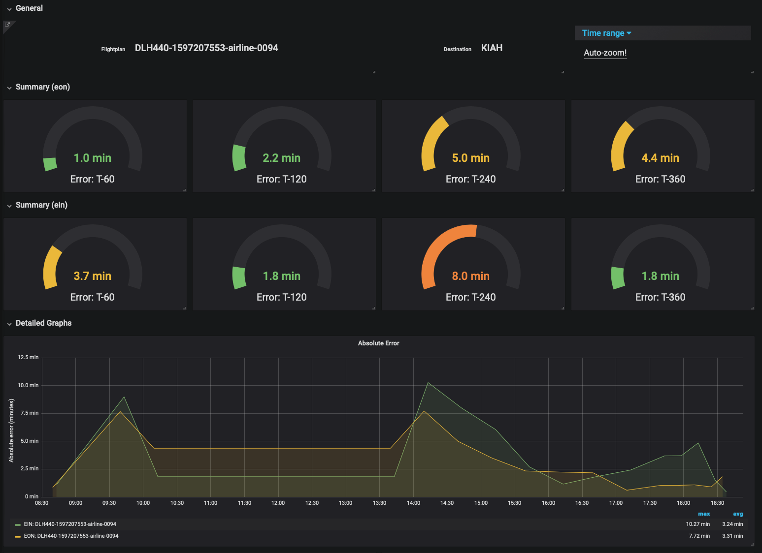
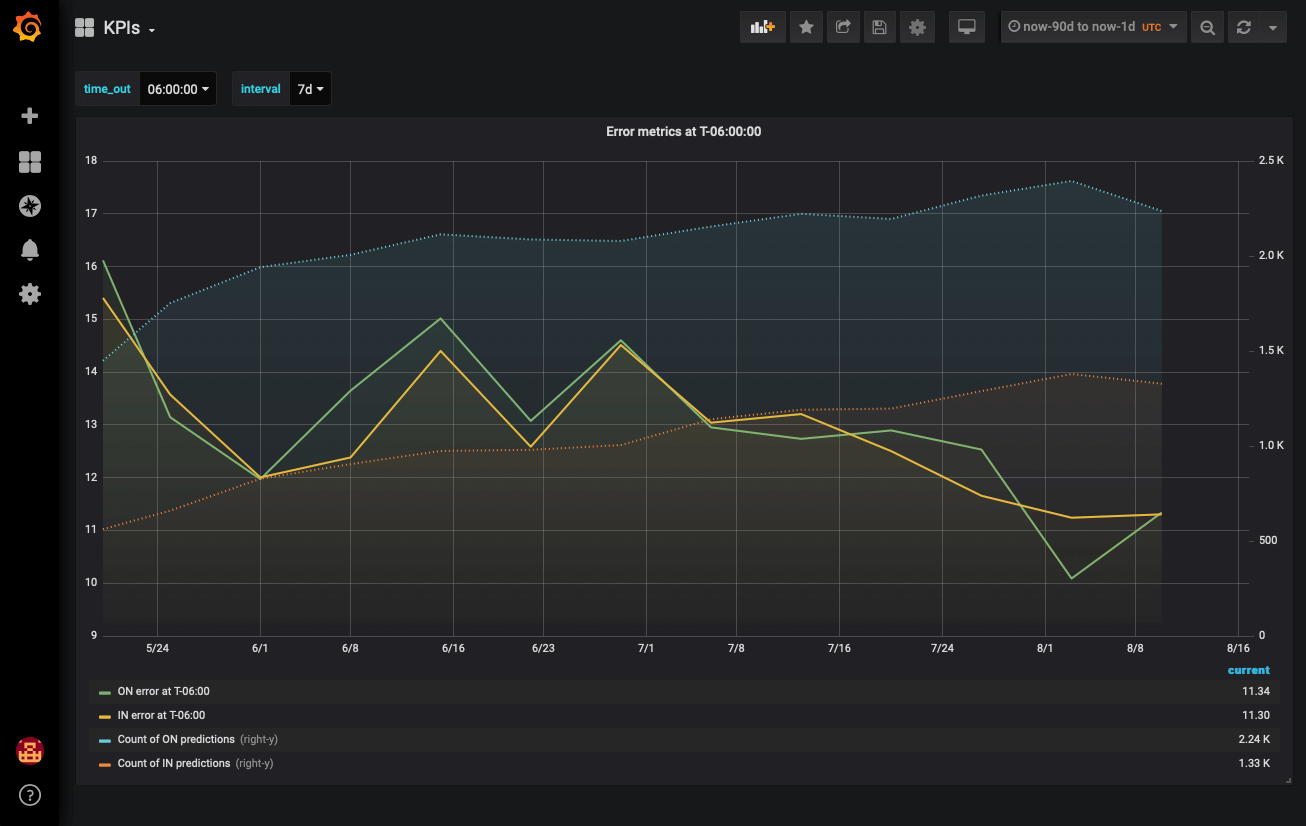
- Track error over time on a per-airport basis
- Track error changes over the course of each flight: e.g. what was the prediction error two hours before the flight landed? One hour before the flight landed?
- Auto-discovery of metrics: for example, when an airport is passed in as a key, a series is added if that airport hasn’t been seen before
- Query and display graphs reflecting prediction error
- Alert on high (or higher-than-normal) error
Our first thought was to use Zabbix for this. Most systems at FlightAware report in to Zabbix in one way or another; we were already using it to track the latency of the streamers. It also has the built-in graphing and alerting capabilities we were looking for.
However, we quickly realized that Zabbix was not the tool for the job. While it has some auto-discovery features, we found them difficult to use, especially in our case of needing >1200 error metrics. More critically, our Systems crew had serious doubts that Zabbix would be able to handle the load of all the metrics we wanted to track. We make predictions for around 75,000 flights per day; if we only stored two error values per flight (much fewer that we wanted), it would require making 100 inserts per minute.
Monitoring with Grafana
These issues with Zabbix led us to look into Grafana as an alternative monitoring solution. Right off the bat we were impressed by its visualization and alerting capabilities. We liked that it supported a number of different database backends, and its extensibility through variables seemed like the perfect way of handling all of our different metrics.
Like the Aviation Platform crew, we first explored using Prometheus as the backend. It was easy to get up and running, and with its built-in visualization tools, it was trivial to explore the data from day one. However, we quickly started running into limitations; the first, and ultimately deciding factor, was that Prometheus is a pure time-series database. It has no support for relational queries (SQL JOINs). With all of the visualization opportunities that Grafana provides, we no longer just wanted to track the error for each flight—instead, we wanted to record each prediction that was made, and the eventual arrival time of the flight, and join them together later to get the error over time. Our other major concern was the number of labels, and the number of values for each label, that we wanted to store. We wanted to store ON and IN predictions for 600 airports, at least 10 times throughout each flight—this works out to 12,000 different label combinations, each of which would have to be stored as a time series, which Prometheus is not currently designed to handle.
We ended up picking TimescaleDB as the database backend instead. TimescaleDB is a time-series extension to PostgreSQL: it chunks time-series tables behind your back, which gives queries a pretty nice performance boost compared to pure Postgres (see this Medium article for more details). In all other ways, it is “just” Postgres—this was ideal, not only because it supports relational queries, but also because FlightAware was already using Postgres for the majority of its databases. We already had a lot of institutional knowledge and familiarity with how to set it up, configure it, tune it, and so on, which made it easy to adopt.
With our choice made, we were able to set up an optimal schema for our problem. Relational queries allowed us to store arrival times in one table and predicted ETAs both from our machine learning models and third-party estimates in another. With Grafana, we alert on high ETA error on a per-airport, per-airline, and per-time out basis; we can compare our predicted ETAs directly to third-party estimates. It gives us confidence in our predictions and provides direction for improvement.
Footnotes
For further details about the inner workings of Hyperfeed, consult Zach Conn’s excellent paper presented at the 23rd Tcl Conference. Major architectural changes have occurred since that paper was written, but most of its content is still applicable and current. ↩︎
For a more general introduction to monitoring distributed systems, a good starting place is the SRE book’s chapter on monitoring. A revealing quote about the inherent challenges of monitoring a complex system: “Even with substantial existing infrastructure for instrumentation, collection, display, and alerting in place, a Google SRE team with 10–12 members typically has one or sometimes two members whose primary assignment is to build and maintain monitoring systems for their service.” ↩︎
Leslie Lamport wryly described a distributed system as “one in which the failure of a computer you did not even know existed can render your own computer unusable.” While humorous, the truth at the heart of his quip—that distributed systems introduce new, frequently inscrutable errors—is undeniable to anyone who has worked on distributed systems. ↩︎
Whitebox monitoring comes directly from the system being monitored. In the case of Prometheus it comes straight from the code itself. This is opposed to blackbox monitoring, which was our focus before Prometheus. Blackbox monitoring comes from an outside observer of a system. It is what a client would see when interacting with the system or what can be observed from the system’s output. ↩︎
In contrast to metrics, other types of monitoring include profiling, which collects a lot of high fidelity information for a short period of time, logging, which can mean a lot of things, but typically contains more dimensions and detail than metrics (and more processing and storage), and traces, which save a lot of detail for a subset of requests and help especially in microservice designs. Every monitoring type has to make a foundational decision about much detail to store and process. ↩︎
Prometheus can just as easily support blackbox monitoring, but its potency derives from the ability to collect metrics directly in an application’s code. ↩︎
This Tcl library will be released to FlightAware’s public Github in the near future. Once that occurs, this footnote will be updated accordingly. ↩︎
In the monitoring world, particularly when it comes to time-series metrics, there is a semi-religious debate about the relative merits of push vs. pull systems, where the distinction comes from how the metrics get to the monitoring system. Since a Prometheus server requests metrics over HTTP it is a pull system. Ultimately the difference is not all that important, but, for an interesting discussion, see this blog post by a core Prometheus developer about the topic. ↩︎
Brian Brazil, the founder of Robust Perception, a consultancy for Prometheus, in the book Prometheus: Up & Running recommends no more than 10k metrics per process, so there are limits, but that is, thankfully, an impractically high number for many cases. ↩︎
While our in-house tool only provided a counter, Prometheus also provides a gauge, which is a value that can go up or down and cumulative histograms, so it replaces our old tool and adds even more. ↩︎
A Prometheus server is meant to run as a single, statically linked binary per data center (or whatever failure domain makes sense) without reliance on distributed storage or consensus algorithms. One server can comfortably handle thousands of machines' metrics in a typical setup. There are also means of scaling out a deployment further if necessary. ↩︎
Sowell, Thomas. A Conflict of Visions. Basic Books, 2007. ↩︎
About the authors