On a ruggedly mountainous Indonesian island called Sulawesi sits a cave containing what is possibly the earliest known example of human storytelling. According to uranium-series analysis, the below scene was etched into limestone some 44,000 years ago, and it shows us a group of eight beings in the act of communal hunting. These ancient discoveries often shine light onto our own experience and reveal an incredible, though unsurprising fact: human beings love stories, we’ve been that way for a long time, and there’s no indication it’s going to change!

In the 18 years since FlightAware was founded, the amount of data informing every aspect of our lives has grown dramatically, and our modern stories are often woven together with numbers and code as much as they are with words and pictures. FlightAware’s own evolution into the aviation intelligence company it is today cannot be separated from the core objective of making meaning from data. This began with basic flight tracking in 2005 and has expanded to cover almost every data point in the aviation ecosystem.
Not unlike the storytellers in that Indonesian cave, we find ourselves at a pivotal moment in history. We are standing at the foot of a colossal mountain of data, and the pressing question is less about the volume of data we have available, and more about how we can use it to tell meaningful stories—stories that empower the aviation industry to reach new heights of efficiency, safety, and innovation.
Data-Driven Storytelling: Shaping the Future of Aviation
As with any good story, preparation and planning are essential. This is particularly true when it comes to data, and it’s why FlightAware has spent years developing systems that guarantee accuracy and dependability in everything from Flight Tracking to Deep Learning Neural Networks. We do this in a number of ways, but much of it begins with our ADS-B network, which is a critical source of global aircraft positions. By fusing these positions together with hundreds of additional data feeds from around the world, we use our proprietary data engine—called HyperFeed—to integrate, process, and enrich that data in real time. This commitment to data quality through rigorous governance, stringent pedigree filters, and constant scrutiny ensures that we’re able to ‘tell the story’ of a flight and do it in a way that is both compelling and reliable.
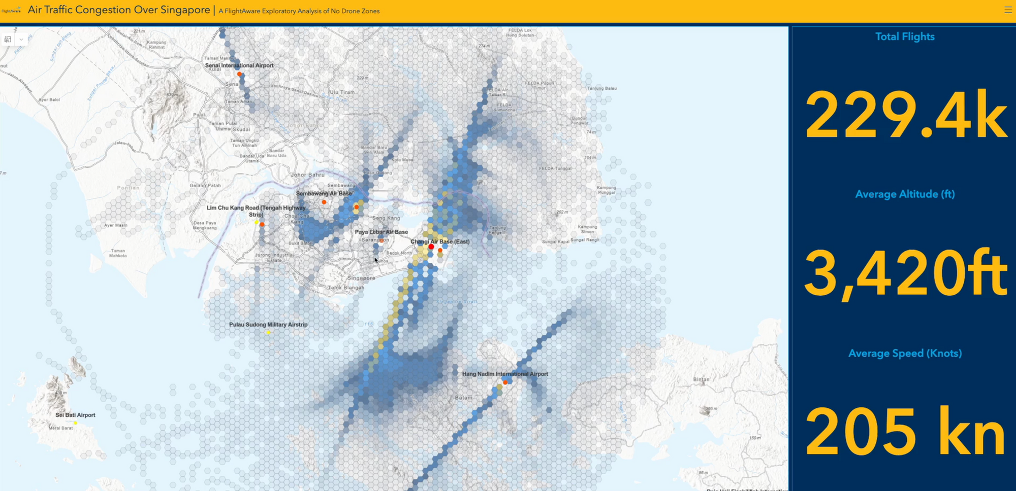
The post-processed data that is then available to our engineering crews opens countless avenues for solving real-world problems. In particular, we’ve found great value in visualizing historical flight behavior in three dimensions using H3 (hexagonal hierarchical geospatial indexing). In short, this approach generates a grid of hex bins that are then overlayed for a defined geographical area. FlightAware recently used this approach to evaluate Singaporean airspace to determine high risk areas for drone operation which deconflicts aircraft and drone flightpaths. To do this, we isolate track data using a script that builds a bounding box for the established geographical region. We then extract parameters such as speed and altitude from our dataset and apply those to the hex bins (in this case average altitude per hex). Using Esri, we were able to construct a three dimensional view of the airspace that can be seen below. To plan for system redundancy, a similar approach is being used by FlightAware’s ADS-B engineering crew leveraging Uber’s H3 grid to evaluate areas of risk where coverage may be adequate, but we are dependent on a suboptimal number of ADS-B receivers. For more information about how we’re applying H3, you can visit this link to watch our joint webinar with Esri.
The beauty of data-driven storytelling lies not just in its visual appeal but also in its power to uncover hidden trends, detect anomalies, and predict future behavior. So, how do we do that? One particular focus is through FlightAware Foresight, which is a suite of Machine Learning tools that cover aircraft arrival predictions, taxi out times, and arrival runways. To learn more about the intricacies of our model architecture, check out this excellent article written by one of our very own engineers, Caroline Rodewig. But needless to say, FlightAware leverages a massive historical archive of flight metadata to train exceptionally accurate ML models for aviation, and we’ve accomplished a feat many have sought out since the advent of modern aviation. We predict critical flight events through a mix of Neural Network and LightGBM based models, and these predictions enable airline operators and global airport hubs to use FlightAware Foresight to drive decision-making in real-time and improve everything from crew utilization and gate readiness to fuel planning and route optimization.
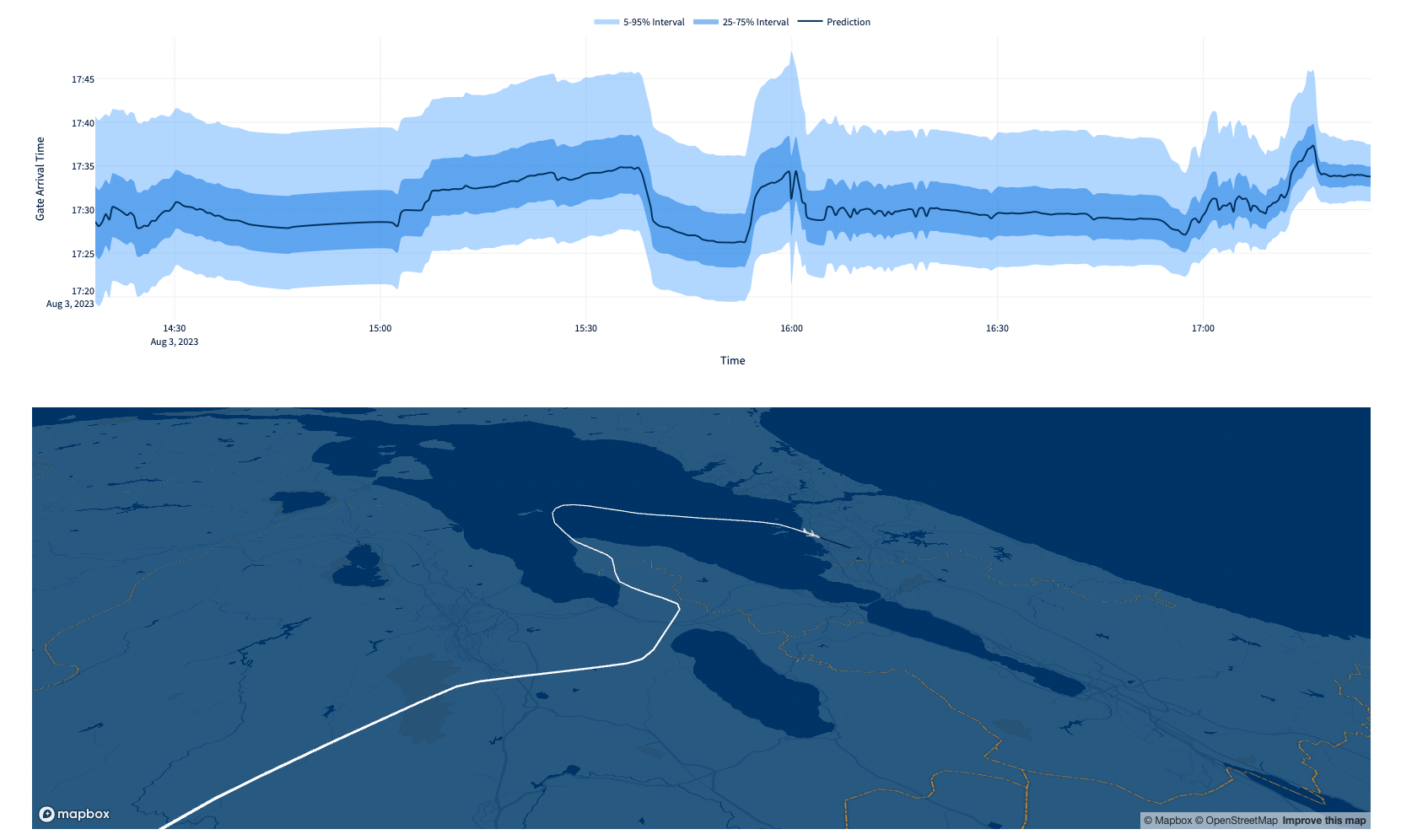
Our approach to data visualization within the realm of machine learning has been particularly helpful in the storytelling process to clarify the tangible value of predictive aviation data. Through tools like FlightAware Foresight Labs and our interactive dashboards, we've made complex information accessible, engaging, and, most importantly, useful! As an example of this, in our latest Streamlit application for “what if my gate changes” users can view quantile estimates for global flights (see below). Within the realm of statistics, quantiles divide probability distributions into equally likely regions. As an example, the median is represented as the 50th percentile, which means 50% of observations in the distribution fall below that value. This functionality was not available in our earlier model architecture and it is now enabled through our Neural Network, supporting a multitude of use cases allowing operators and data scientists to essentially bias predictions to address specific areas of need (like making sure flights will not arrive later than a prediction). With tools like Streamlit, Grafana, Tableau, Esri, and many others, we are representing flight behaviors and trends in a way that’s easy to comprehend, which is critical in the constrained environment of modern-day operations.
Data Visualization: Unlocking Value
Decoding value from petabytes of aviation data does, however, present unique challenges. In its raw unformed state, this data is like a nebulous cloud of facts and figures, laden with possibilities but infused with complexity. Our challenge is wrangling this magnitude of data to isolate meaningful insights amidst the static. This looks different across our various engineering teams and ranges from building ETL pipelines for Machine Learning development, all the way to executing complex SQL queries across thousands of available data tables to produce reports for a variety of customers. In essentially every use case, the raw data must be carefully analyzed, cleansed, and translated into a comprehensible form before its true value can be revealed.
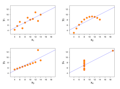
While visualizations are not the only means of getting value from raw data, as we’ve established, human beings are drawn to patterns and pictures. From ancient constellations mapped across the night sky to the user interfaces we carry in our pockets and wear on our wrists, we rely on visual representations to help us comprehend remarkably complex subjects. For example, we can reflect on Anscombe's Quartet (see figure below), a case of four datasets with identical statistical properties that, when visualized, reveal dramatically different relationships. This is a great example of how the power of visuals can help us interpret large amounts of information.
In his seminal work "Thinking Fast and Slow," psychologist Daniel Kahneman discusses two cognitive systems that steer much of our thoughts and behaviors. Dubbed ‘System 1’ and ‘System 2’, these work in tandem but have distinct roles. ‘System 1’ is the agile side of us, operating intuitively and quickly with little conscious effort, like a kind of autopilot. On the other hand, ‘System 2’ is our meticulous navigator, intensely allocating attention to complex mental operations that demand focus.
Skillful data communicators must understand these systems and how they work within our brains. What is perhaps surprising is that many analysts often unknowingly push their audiences to decipher data through the more demanding ‘System 2’. To illustrate this, let's refer to the concept of 'preattentive attributes,' as explained in "The Big Book of Dashboards".
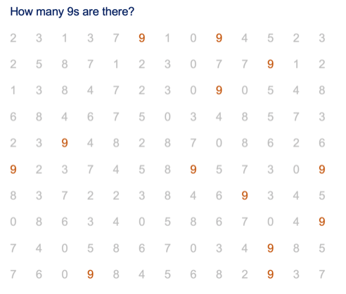
Preattentive attributes are sensory signposts our brains immediately process before we consciously focus on anything. There's a whole array of these attributes, like color, size, length, and orientation, which act as subconscious cues. For instance, in the first diagram below, how many 9s are there? It seems like a simple question, but without a way to distinguish them, we involuntarily engage ‘System 2’, triggering a difficult mental computation.
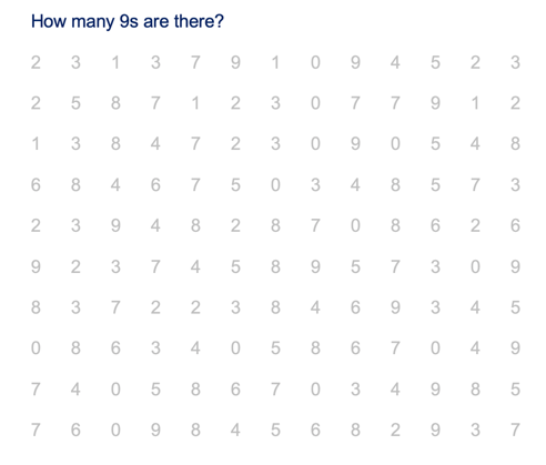
However, as soon as we color-code the 9s, finding and counting them becomes a simple task. In this instance, color serves as a potent preattentive attribute. As we scan a scene or evaluate a chart, our brains process preattentive attributes in less than a second. At FlightAware, we’ve used this fundamental human behavior to influence the design of tools like our Foresight Dashboard, where colors and symbols indicate when FlightAware’s arrival predictions differ—early or late—from legacy sources of non-ML arrival times. This creates a nearly immediate recognition of flights that may demand action. Things like resources at a gate for early aircraft or managing tight connections for those expected to be late. The art and science of effectively communicating with data lies in leveraging these attributes, capitalizing on the mental strengths of efficiency and speed available through ‘System 1’.
Conclusion:
By prioritizing data accuracy, integrity, and visualization, FlightAware ensures that the stories being told are instrumental for enhancing efficiency and innovation throughout the aviation industry. The next phase of this commitment involves a focus on building performant visual tools that connect directly to FlightAware data through cloud infrastructure.
Our on-prem architecture reliably and securely manages nearly 7 petabytes of historical data. We absolutely must maintain this level of stability as we move forward and continue to innovate, and we’ve got to do this while simultaneously exploring ways to maximize performance through optimizations that cloud infrastructure offers, especially when querying large amounts of historical data. This is a primary reason we’ve begun experimenting with data replication in AWS Redshift to assess how it may be used to enhance our ability to isolate trends and patterns, and to do it more quickly than previously possible. We’re constantly evaluating how the tools and technologies we develop are being applied, and our users range from travelers looking for when to leave for the airport, all the way to the world's largest organizations who depend on our data for their operations.
As we’ve outlined, data is fundamental to FlightAware’s business; however, we don’t simply produce charts, CSV files, and predictions—we showcase the narratives that influence the future of air travel. From ancient etchings in the caves of Sulawesi to today's sophisticated technical landscape, the origins of human storytelling are elemental, and since its inception, FlightAware has been at the forefront of reimagining storytelling in the realm of aviation.
Reference Links:


