

One of FlightAware’s main goals is to put flight data into context to tell a broader, interconnected story about a flight, airport, or other part of the aviation ecosystem. One of the ways we do that best across all our product surfaces is by presenting information on maps.
At FlightAware, rich, interactive maps that bring our flight data to life are central to many of our product surfaces. Our maps complement static presentations of the data like tables and times, helping our users get more insight and value out of our data. Getting to work on our maps is one of my favorite things about working at FlightAware, and I’m always looking for ways to show more data on them and make them more engaging for our users. In the iOS app, my primary focus at FlightAware, we have a strong foundation for this – we built a flexible, extensible mapping system for displaying flight data. This does have its tradeoffs, though, one of which was the motivator for this project. On our website, we built new maps with detailed, vector-based tiles that have an especially high level of detail on the airport surface, showing gates and runways sourced from OpenStreetMap data. Unfortunately, the MapKit framework on iOS doesn't have a native renderer for third-party vector tiles, so we are unable to use them directly in our app and therefore can’t show the gates and runways they have.
As a workaround, we shipped support for rasterized versions of our new tileset to the iOS app earlier this year, but this isn’t perfect. It has a few downsides:
- It’s just one of our base map options in the app, so you’d only be able to see the gates and runways when you chose this base map. Our tiles don’t show many streets or city/place names, so people may not want to keep them on all the time depending on what they’re using our map for (for example, it’s harder to locate an aircraft by referencing less important roads or landmarks a user may be familiar with).
- To minimize clutter in the raster tiles, the gates don’t show until you zoom all the way in to zoom level 17. When you do, the gate labels are baked into the rasterized image, so the text may not look very crisp (depending on how far you are into the discrete zoom level).
- Because the runway labels are baked into the raster images, we can’t highlight them depending on which are active or which a particular flight used, something I really wanted to do to help bring that data to life.
- The runways in the tiles are labeled like
10/28(encompassing both ends of the runway) – so to really make sense of the data, you have to know which end is which. Runways are numbered based on magnetic heading, so you can figure this out, but it might not be very accessible to people who aren’t hardcore aviation enthusiasts or pilots. Ideally, this information would be accessible to a wide audience without them needing to understand or work out magnetic headings.
To address these issues, I thought it would be a good idea to show gate and runway annotations natively on the MapKit map. This would let us show them on all base maps, would let us customize the zoom level at which they show/hide to work better on mobile devices with small screens, and would also allow us to highlight them dynamically or add additional information (like which runway was used for an arrival or departure) depending on what else the map is depicting.
In this post, I’ll chronicle how I built this feature from start to finish. Along the way, I'll highlight how the collaborative culture and highly competent engineers we have here at FlightAware enabled me, an engineer on the Mobile team, to do not only the frontend but also the incremental backend work for this project. I’ll also take the opportunity to show how the multi-year modernization journey we’re in the midst of has enabled more developers at FlightAware to take part in this collaborative contribution model, accelerating the pace of delivery across the organization.
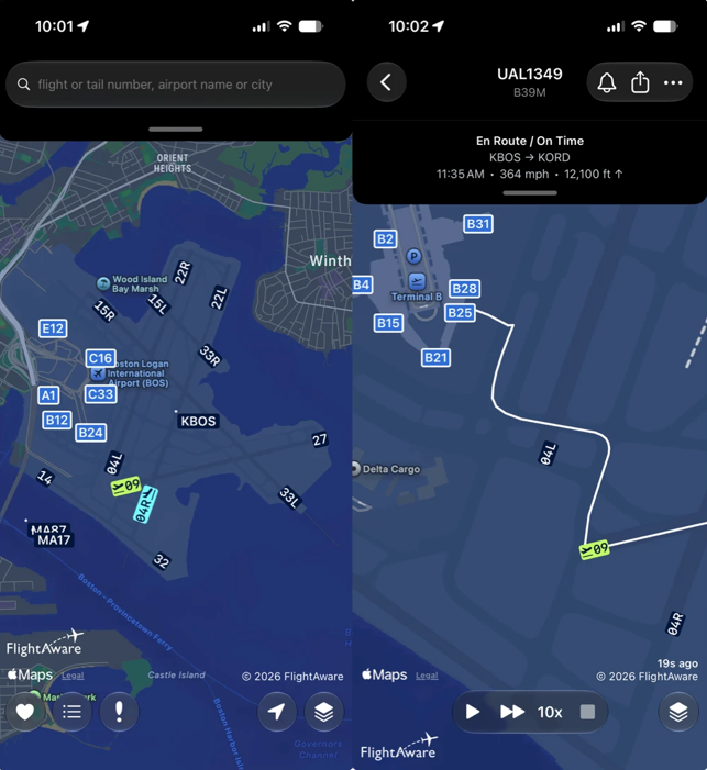
Step 1: Sourcing the data
To make the gates and runways available to mobile clients, we would need to expose them through an API. This requires having the information in our database. FlightAware has a very comprehensive dataset about the aviation ecosystem, and we already had information about runway endpoints worldwide (sourced from a third-party vendor’s ARINC 424 navigational data set). This meant the principal challenge was sourcing the gate information, which wasn’t previously included in our dataset.
Our vector map tiles are sourced primarily from OpenStreetMap (along with several other datasets), and OpenStreetMap contributors have mapped tens of thousands of gates at airports around the world, so it was natural to piggyback on the ETL pipeline we’ve built for that data. I wrote a PostGIS query to find gate features at airports around the world. This query executes against the ephemeral database of OSM features used in the ETL pipeline (built on Apache Baremaps) and the results are used to populate a table in our main database.
At FlightAware, we have people with strong knowledge of the OpenStreetMap data model and extensive experience writing PostGIS queries, and they helped immensely with review and feedback on my query and schema design. Although they weren’t on my team and this wasn’t their project, they were more than happy to jump in and help me get it right. This collaborative culture (which will come up again and again throughout the rest of this post!) is one of the great things about working at FlightAware.
Step 2: GraphQL schema change
At FlightAware, many of the microservices that make up our modernized architecture are tied together by one GraphQL schema. We have a structured proposal process (basically a pull request with a few required approvals) for evolving this schema, to ensure that all teams affected have an opportunity to shape the design and that the additions we make take full advantage of GraphQL’s type system and will be extensible enough to avoid breaking changes in the future.
I wrote the proposed changes for the GraphQL schema, and once again engineers from other teams jumped in to help review and refine the schema so that it accurately reflected all the possibilities and left room for future expansion. Once it was approved, it officially became part of our GraphQL schema.
Step 3: Backend microservice implementation
With the data in the database and the GraphQL schema all set, I was ready to start implementing the backend changes.
At FlightAware, our modern backend services are mostly written in Go, so it’s fairly easy for a contributor like me from another team to pick them up and contribute new features quickly. Unit and integration tests help ensure confidence in changes. Although each microservice is maintained by a specific crew, members of other crews are able to contribute and it’s fairly easy to do so without having to pick up a bunch of specialized knowledge about the system. Our modernized services at FlightAware have made it easy for more people than ever to contribute, rather than requiring members of a dedicated backend crew to make changes, which would incur communication overhead and be subject to scheduling constraints.
Engineers from other crews jumped in to help review my code and help me deploy it to production, once again highlighting FlightAware’s collaborative, helpful culture.
Step 4: Client code and deployment
With the backend services deployed to the staging environment, developing the changes for the iOS app was a straightforward process. Our map system is flexible and extensible, and I was able to add the gates and runways without too much trouble. The changes were reviewed via our normal code review process on the Mobile team.
The more interesting part was the deployment. As previously mentioned, the gate and runway data delivered via our GraphQL API comes from our database. This is a single Postgres database (with many read replicas) that powers most of the FlightAware website and AeroAPI, so its reliability is pretty important. We wanted to make sure that the API requests would not cause unexpected load on the database. To mitigate this possibility, the backend services use an in-memory cache, but we had no easy way to know the API request volume and resulting database load this feature would generate.
To avoid potentially “DDoSing” ourselves with an unexpected volume of requests, we deployed this feature with a client-side feature flag that would allow us to incrementally roll out this feature, monitor the impact at each increment, and roll it back if necessary. We built a remote configuration system for the iOS app in the past few years as part of our overall modernization, and it’s proven its usefulness in incrementally rolling out new features that have the potential to go wrong. This is a great example of a modern practice that gives us the confidence to accelerate our delivery.
With each increment of the feature flag, I monitored the backend request volume and resulting database impact. Many of our Go microservices are instrumented with Open Telemetry, with the data flowing to Datadog for viewing and analysis. This made it easy to find out exactly how many of our GraphQL requests were from clients requesting the gates and runways and how many of those were going to the database instead of being serviced by the cache. The feature flag, combined with our modern observability stack, allowed us to be more confident in the deployment by giving us a way out along with an easy way to tell if we needed to use it. These are things that would have taken a lot more work to do with the legacy FlightAware stack – just one more proof point of how important our modernization journey is and the impact of every team modernizing their stack.
Conclusions
In some ways, the story described in this blog post is unremarkable. An engineer has an idea, works across teams to get it done, and there’s a sprinkling of organizational review processes along the way. It’s implemented in a microservice backend and deployed to clients with a feature flag. All of this is fairly standard for a modern engineering organization deploying features at scale.
However, the reality is that for FlightAware, before our modernization journey began, many of these steps would have required a lot more effort, probably needing to be done as part of a larger initiative and with the establishment of a crew of several engineers specialized in frontend and backend areas. In some cases, we would have had to build homegrown solutions instead of using off-the-shelf components. The use of accessible, industry-standard technologies in our new stack enables engineers from across the organization to make productive contributions across the entire stack, not just the area in which they’re specialized. Pair that with the strong code review culture we have and the willingness our engineers have to jump in and help, and the result is an engineering organization equipped to keep innovating new ways to make flight data more interactive and engaging for our users.