The flight page is the single most-viewed page on the FlightAware website, and as FlightAware QA, ensuring that it works as expected is one of our most important duties. The flight page changes how it displays data and what data it displays significantly for different flights, different users, and different access methods for the page, and we (QA) must ensure that we document and test the relevant variations whenever the flight page is changed. In this blog post, I’m going to be describing several of the ways that the flight page displays data, as well as the testing perspective for a given view of the flight page. In many cases, we have well-established Playwright automated UI tests to help prevent regression, but there are often specific details that must be considered for manual testing, or unique options or pages that have been created to help test certain niche functionality.
COMMERCIAL VS GENERAL AVIATION FLIGHTS
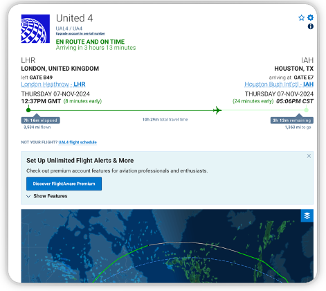
The flight page’s layout when viewing a commercial flight is geared towards passengers and those who are following their progress. Because of this, the arrival and departure information are much more prominently displayed than on a General Aviation (GA) flight page, and gate information is present. Commercial flight pages will also detail information about the flight’s airline and include a link to the airline’s website.

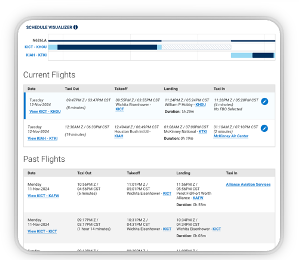
The layout for GA flights, on the other hand, is geared towards owners and operators, formatting its data in a way more convenient way to them and providing them with appropriate options. If you are the flight’s owner or operator, you will have options on the flight page to make certain choices for your flight or change flight times for future flights. The information you’ll see on the page will cover various details including takeoff and landing times, origin and destination airports, and weather information in more detail than the general public’s view. The flight log will show more extensive information as well and will include a schedule visualizer table if you have multiple flights in the near future.


From a tester’s perspective, the Commercial and GA flight page layouts are the two primary layouts for the flight page. These views are well-covered by automated tests and are exercised by almost any manual testing done on the flight page. Each is always considered at every step when making changes or implementing new features that impact the flight page, including design, development, and testing. Additionally, the GA flight page is tested to ensure that it shows the expanded options and data to its owner/operator (and not to anyone else), while the commercial flight page should display the airline’s logo and information properly. Automated and manual tests are set up to ensure these work as expected.
MOBILE
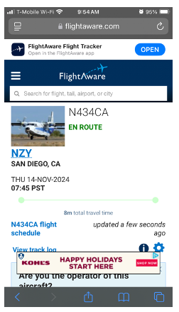
The main difference between the mobile and desktop flight page is that the mobile view contains all the information on the page in one condensed column, rather than two. We also hide the map replay functionality to make the page easier to navigate, and different ads are displayed to accommodate the smaller window size and single column.
New features and updates are tested on both mobile and desktop platforms, utilizing Playwright for any automated tests as that is the standard UI testing framework at FlightAware. Mobile does present some testing difficulties (such as testing various device screen sizes), but modern browsers and Playwright have ways to handle them and make it easy to simulate a mobile environment while testing. Most of FlightAware’s web traffic comes through mobile, so that platform is always an important consideration for us when testing changes to the flight page.
USER PERMISSIONS
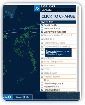
While flight type (commercial vs GA) and device type (desktop vs mobile) are some of the biggest factors for determining flight page data and layout, there are a multitude of further different options and views that can cause additional changes. Various subscriptions give users access to different tiers of data, and it’s important that we keep these straight. The map within the flight page has options that vary per subscription level as well. Higher tier users will have access to more map layers options and overlays, as well as privileged data when displaying the flight path on the map. This allows higher-tier users to have more extreme levels of precision for their flight paths, especially in areas where ground data is harder to collect, such as in the middle of an ocean.
Changes to our permissions functionality are rare, mostly occurring when a new subscription is introduced. As with any new feature, these updates are extensively tested, both manually and with automated tests. When it comes to permissions, our automated testing is extensive; ensuring each subscription type works as expected is one QA’s highest priorities, and so there are a numerous Playwright tests covering that functionality. These types of changes also involve extensive manual testing; each existing subscription with intersecting data undergoes thorough regression testing to validate that it continues to behave as expected.
PERSONALIZATION
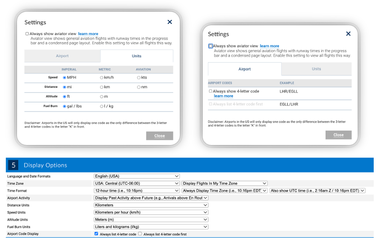
Beyond the subscriptions they’ve signed up for, users can also personalize the flight page by making selections determining how data is displayed. They can configure their preferred timezone and time format (12 or 24 hour, the flight’s local time(s), their local time or Zulu time), how airport codes are displayed (3 or 4 letter codes, or both, and if both which order), and various measurement unit settings (speed, distance, altitude, and fuel burn can all be configured individually). Additionally, they can toggle “aviator mode”, which makes commercial flight pages display their data using the general aviation layout. They can also, of course, change the website’s language, which may also rearrange the UI elements if a right-to-left language is selected.
These changes can be somewhat finicky to test, due to their modular nature. While some of these options have automated tests in place, it’s largely up to the tester to determine what manual testing needs to be done for each change and how best to do it. This varies depending on what parts of the flight page any changes will affect. For instance, when adding new airport runway data to the flight page, changes to airport name and time display options had to be considered due to nearby UI elements. We needed to ensure that even very lengthy names and times did not push any of the new fields out of alignment, even on smaller mobile devices. While most of these options only make minor changes on the UI, it’s still important that the flight page update properly and look good with each possible set of options. In many of these cases, the best solution for testing them is relying on QA experience and skill in manual/exploratory testing to ensure that everything important is verified.
OTHER CHANGES
In some instances, we’ve built tools to exercise functionality for a given set of options. For instance, we’ve created a rough catalog of different types of maps with an admin page where you can select one of the map types, have it find, or generate, and display said map so you can easily test any niche functionality. For instance, older flights show restricted weather data and cannot be shared via email, and position-only flights won’t have departure or arrival airport information. Certain maps are also used by airlines to track or display flights on their websites or at airports, and we can easily access testing versions of those through this page as well.
As another example, we have an alternate view of the entire website that’s accessed through a different portal which must be exercised when testing UI changes. This alternate view changes the format of the times and airports on the flight page as well as removing any images present. To test that functionality, we have an option on our test environments themselves to simulate that alternate portal which we can toggle on as needed. This option, and others specifically designed to help us test niche but important functionality, are very useful when releasing new features or updates and go a long way towards preventing regressions. They’ve been developed and maintained over time to help solve the problems we’ve run into while testing over the years and have become invaluable.
CONCLUSION
The flight page has experienced significant growth since it was released many years ago. A lot of new functionality has been added, a lot of existing functionality has been modified, and a lot of new subscriptions and user types have been added to our website. As the FlightAware website and its flight page continue to evolve, it’s important to document the functionality that’s present and ensure that it keeps working as expected. And so, as QA, we endeavor to do just that: keeping track of various bits of obscure functionality and different ways the flight page displays; doing whatever we can to best test it. We’ve been largely successful on this front thanks to a mix of automated tests, manual testing, special tools for accessing alternate views, or any combination thereof.


